If you’ve been watercolouring for a year or more and you’re starting to feel like your standard pan set is limiting you, you’re probably ready to explore beyond the entry-level palette — but not necessarily ready to drop $60 per tube on artist-grade single pigments. This is exactly where specialty sets earn their place. Watercolour, for anyone new to the term, is a water-soluble paint that produces transparent, layered washes of colour; it differs from gouache or acrylic in that the white of your paper shows through rather than being covered. Gansai (pronounced “gan-sigh”) is a traditional Japanese form of watercolour with a distinct binder and opacity profile — it behaves differently to the European-style watercolours most Australians start with. Terracotta palettes are Western sets formulated around earthy, warm-muted tones rather than the full spectral range. This guide walks through the most-talked-about specialty sets available in Australia right now — what each one actually does, who it suits, and where the real tradeoffs lie.
What Makes Gansai Different — and Why Kuretake Gansai Tambi Keeps Coming Up
Gansai paint uses a different binder system to European watercolour. Where most Western watercolours are bound in gum arabic (the same substance that gives them their characteristic transparency and flow), traditional gansai uses nikawa, an animal-hide glue, which produces a denser, more opaque result. It sits closer to gouache — opaque paint — on the opacity spectrum without crossing fully into it. The practical effect: colours look richer on the surface and the paint reflects light slightly differently. Reviewer analysis aggregated at Maker and Student’s comparative breakdown of gansai vs Western watercolour consistently notes this as a meaningful difference, not a marketing distinction.
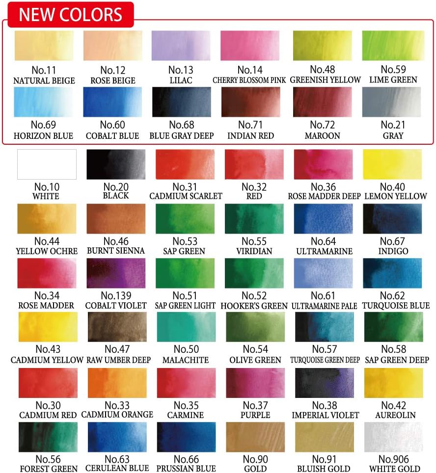
Kuretake’s Gansai Tambi line is the set most Australian intermediate painters encounter first, and reviewers across both the 18-colour and 48-colour configurations keep returning to two physical advantages. First, the pans are significantly larger than a standard half-pan — a practical difference when you’re loading a mop brush for a large wash, because you’re not scrubbing at a tiny disc. Second, each pan is printed directly with its colour name in both Japanese and English. That sounds minor until you’ve spent three minutes trying to remember which of two near-identical blues is Prussian and which is Ultramarine. Reviewers consistently call this genuinely useful rather than gimmicky.
There’s also a social proof dimension worth naming honestly: reviewers across multiple platforms specifically cite buying Gansai Tambi because prominent watercolour practitioners on YouTube use it. That’s a reasonable signal. When working practitioners choose a product on camera, it usually survives the comparison between alternatives — their reputation depends on it. The 48-colour set represents the more complete investment for someone building a reference palette, while the 18-colour set makes sense as a genre-specific addition to a Western palette you already own.
The tradeoff to know: gansai colours aren’t rated to the same lightfastness standards as artist-grade European watercolours. Lightfastness — how resistant a colour is to fading under UV light — matters more for finished work that will be displayed or sold than for sketchbook practice. If you’re making archival work, Jackson’s Art’s published watercolour paint guide is direct about this: gansai should be treated as a working medium rather than an archival one. If you’re using it for illustration, sketchbooking, or work that will be reproduced digitally, the lightfastness gap is largely irrelevant.
The Fuumuui Terracotta Set: What “Muted Tones” Actually Means for Your Work
The Fuumuui 36-colour terracotta set occupies a specific niche that’s hard to describe until you see it: a palette built around earth tones, dusty pinks, warm neutrals, and muted greens, formulated to read as slightly opaque and chalky rather than brilliant and transparent. Reviewers who have moved from conventional watercolour sets to this palette consistently describe the mood it creates as “peaceful” or “quiet” — and that’s not just poetic language. When a pigment is formulated to be semi-opaque with low chroma (saturation), the resulting washes have less visual tension. It reads differently to the eye.
This is closer to gouache (fully opaque watercolour paint) in character than to transparent watercolour, but it’s not labelled as gouache — it sits in a genuinely hybrid zone. For painters drawn to the current wave of slow, contemplative illustration and botanical art, this is a feature, not a compromise. The practical downside is that it’s less versatile: if you want to glaze transparent layers one over another (a core watercolour technique), muted semi-opaque colours will cloud up rather than building luminosity. That’s the fundamental tradeoff for this palette type.
Who it suits: intermediate painters exploring a deliberate aesthetic direction rather than those still building core watercolour fundamentals. If you’re not yet comfortable with wet-on-wet washes and basic colour mixing, a fully muted palette will make it harder to see what your technique is doing.
Daniel Smith, MeiLiang, and Artecho: The Value-Stack Decision
This is where the tradeoff math becomes worth laying out explicitly.
By the numbers (AU market, May 2026):
| Set | Approx. AU street price | Pigment grade | Lightfastness rated? |
|---|---|---|---|
| Daniel Smith Essentials Mixing Set (6 tubes) | $85–$100 | Artist-grade | Yes (ASTM) |
| Winsor & Newton Cotman 24-pan set | $45–$60 | Student-grade | Partial |
| MeiLiang 36-colour set | $18–$28 | Student-grade | Not independently rated |
| Artecho 100-colour set | $35–$55 | Student-grade | Not independently rated |
Daniel Smith is genuinely different from the others in this comparison — not marginally better, but categorically different in pigment formulation. Reviewers who switch from Cotman or Van Gogh to Daniel Smith frequently report the same surprise: they’ve wasted paint on first use because the pigment concentration is dramatically higher than they were used to. A pea-sized squeeze of Daniel Smith does the work of a larger amount of student-grade paint. That changes the cost-per-use math significantly: the higher price per tube spreads further than it first appears. Wirecutter’s aggregated watercolour paint assessment notes Daniel Smith’s single-pigment formulations (colours made from one pigment rather than a mix) as a primary reason practitioners favour it — single-pigment paints mix more predictably and produce cleaner secondary colours.
The MeiLiang set occupies a different category entirely. A reviewer who owns both MeiLiang and Cotman describes the MeiLiang not as a replacement but as a budget supplement — useful for expanding range without commitment, or for rough sketches where you don’t want to exhaust better paints. That’s the honest positioning for this bracket.
The Artecho 100-colour set is the surprise in the category. Reviewers who expected a disappointing result at this price point report finding pleasing pigmentation across most of the range. The realistic expectation should still be: student-grade, not independently lightfast-rated, variable pan quality across 100 colours. But as a colour-exploration tool for someone working digitally or in a sketchbook, the value case is real.
The if/then decision rule:
- If you’re making finished work to sell or display: Daniel Smith’s lightfastness ratings and pigment concentration justify the price. The cost-per-use gap over Cotman is smaller than the sticker price suggests.
- If you’re a committed sketchbooker or working digitally: Gansai Tambi 48 or a MeiLiang supplement makes more economic sense — the archival difference doesn’t apply to your use case.
- If you’re drawn to a specific mood or aesthetic (earth tones, botanical, slow illustration): The Fuumuui terracotta set is a deliberate tool, not a compromise — buy it alongside rather than instead of a transparent set.
- If you’re still in the colour-exploration phase: The Artecho 100 at its price point is a reasonable sandbox. Expect student-grade results; don’t expect archival permanence.
Frequently Asked Questions
Is Gansai Tambi watercolour the same as regular watercolour or does it behave differently?
It’s related but genuinely different. Gansai uses a traditional Japanese binder (nikawa, or animal-hide glue) rather than the gum arabic used in European watercolour. The result is more opaque, richer in surface colour, and closer to gouache in visual texture. It rewets well from dry — like Western pan watercolour — but doesn’t layer transparently the same way. Maker and Student’s comparative breakdown of gansai vs Western watercolour describes it as a medium in its own right rather than a substitute. Treat it as an addition to your toolkit rather than a drop-in replacement.
Can you mix Kuretake Gansai paints with Western watercolour paints on the same palette?
Yes, physically you can — they’re both water-soluble and will combine on the palette or on paper. The practical complication is opacity: gansai is more opaque, so mixing it into a transparent Western watercolour wash will cloud the wash. Some painters use this intentionally to knock back a colour’s chroma. If you’re mixing them, test the combination on scrap paper first, because the binder systems do interact and the result can look chalky if you’re not expecting it.
Are muted or terracotta watercolour palettes suitable for beginners or are they more of an intermediate tool?
Honest answer: they’re more useful once you have basic watercolour technique in hand. A muted, semi-opaque palette like the Fuumuui terracotta set reduces the visual feedback that helps beginners understand what their brushwork is doing — transparent paints show errors and successes more clearly. That said, if a beginning painter is drawn to the aesthetic and doesn’t have strong expectations about transparency, there’s no rule against starting with it. Just be aware that the techniques in most watercolour tutorials assume a more transparent medium.
How many colours does a beginner actually need in a first specialty set?
Fewer than you think. The Artists Network’s watercolour basics guidance consistently points to a 12-colour limited palette as sufficient to mix almost everything you need. For a first specialty set — say, a Gansai Tambi as a cultural/aesthetic exploration alongside a Western palette — the 18-colour configuration is genuinely enough. The 48-colour set makes sense when you want a comprehensive reference, not as a starting point.
Is Daniel Smith worth the price compared to Cotman or Van Gogh for someone at an intermediate level?
For most intermediate painters who are moving into finished work — work they’ll frame, share, or sell — yes. The key reasons: single-pigment formulations mix more cleanly, pigment concentration means the cost-per-use gap is narrower than the sticker price suggests, and ASTM lightfastness ratings give you confidence in archival work. Van Gogh (Royal Talens) sits in an interesting middle position — better than Cotman, rated for lightfastness, but not single-pigment across the full range. If you’re still primarily sketchbooking or practising, the upgrade to Daniel Smith can wait; the gain is most meaningful when you’re making work you want to last.