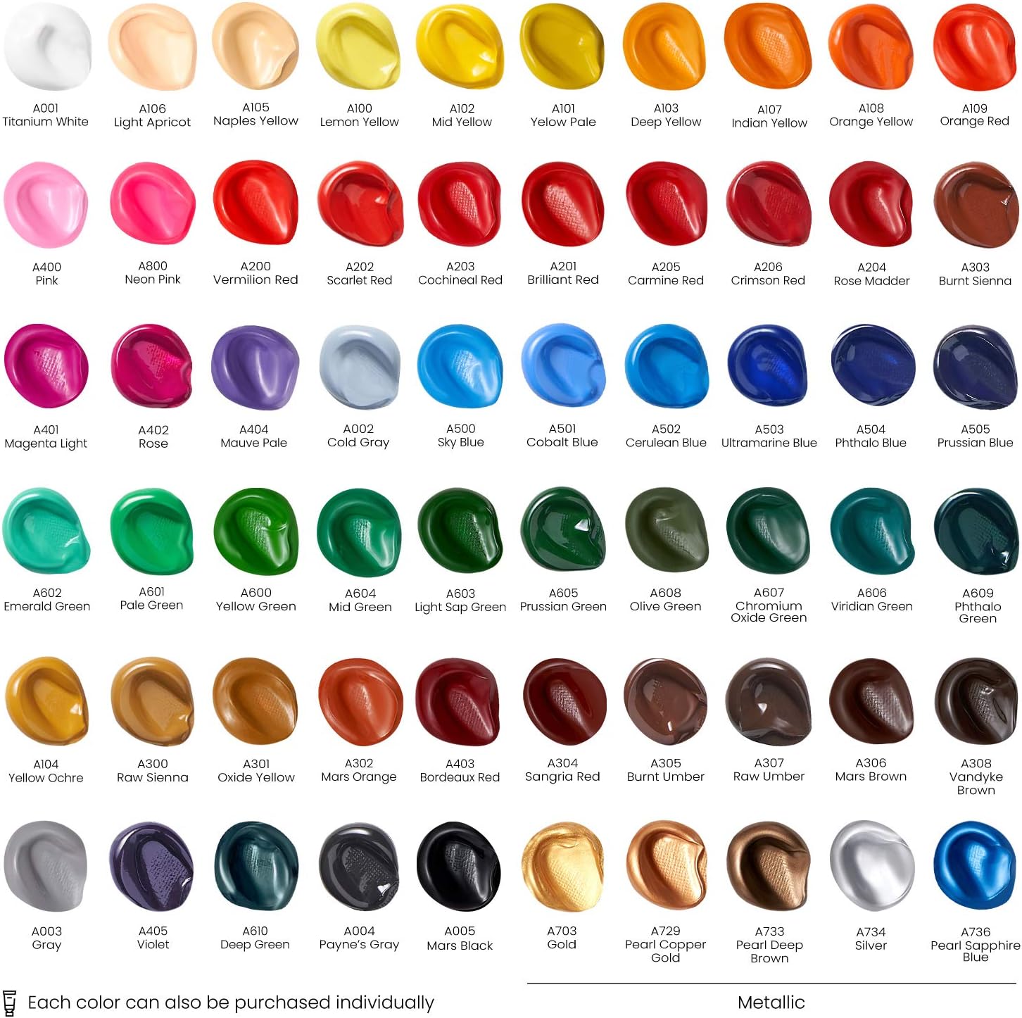
If you’ve walked into a craft shop, picked up a starter acrylic set, and thought “that looks fine” — only to arrive home and find your colours muddy into grey, your brushstrokes lifting off the canvas, and your reds looking like terracotta after they dry — you’ve met the gap this article is here to close. Acrylic paint is a water-based paint that dries into a flexible plastic film; it’s one of the most forgiving mediums available, which is exactly why it dominates beginner shelves. But the tube label tells you almost nothing useful: it names the colour, sometimes lists a lightfastness rating (a measure of how resistant the pigment is to fading over time), and occasionally hints at consistency. It won’t tell you that the tube contains two different pigments that will separate when you mix them, or that the “student grade” binder (the liquid that carries the pigment) will cause your colours to shift two shades darker when dry. After reviewing published product data, manufacturer technical sheets, and the consistent patterns that surface across owner reports and specialist retailer guidance, here’s what actually matters before you spend.
The Grade Gap Is Real — and It’s Not Just About Price
The single most consequential decision you’ll make isn’t which colours to buy; it’s which grade to buy. Acrylic paints are commercially produced in two main tiers: student grade and artist grade (sometimes called professional grade).
Student-grade paints — think Winsor & Newton Galeria, Daler-Rowney System3, or Matisse Flow in its entry formulation — use a lower pigment load (less actual colourant per millilitre of paint) and often rely on filler pigments or pigment mixes to hit a price point. The result isn’t that they’re bad. It’s that they behave differently in ways that undermine learning. When you can’t mix a clean secondary colour, or your painted layer looks chalky, you tend to blame yourself. Usually it’s the paint.
Artist-grade paints — Liquitex Professional Heavy Body, Golden Heavy Body, Matisse Structure — use single pigments where possible and higher pigment-to-binder ratios. They’re significantly more expensive per tube (AU$25–$60 for a 59ml tube at May 2026 prices), but they mix predictably, they dry true, and the skills you develop with them transfer directly to advanced work.
The practical tradeoff for a first-time canvas painter: You don’t need artist grade for everything. But you do need it for your primary mixing colours — the four or five tubes that will do 80% of the work. Jackson’s Art’s acrylic buying guide puts it plainly: start with a limited palette of quality pigments and expand from there. Buying a 24-colour student set and a 6-colour artist set for the same budget as a 12-colour mid-range set gives you worse results than simply starting with six great tubes.
What the Tube Label Actually Tells You (If You Know How to Read It)
Once you know where to look, the label becomes useful. Here are the three things worth checking before you buy.
1. The pigment code. Printed as an alphanumeric shorthand (e.g., PY83, PR101, PB29), this tells you exactly what colourant is in the tube. PY is a yellow pigment, PR a red, PB a blue, PG a green, PBk a black, PW a white. A single-pigment paint — one code on the label — will almost always mix cleaner than a multi-pigment paint. If your “Cadmium Yellow Hue” lists three pigment codes, it’s a blend. That’s fine for opaque layering, but it muddies fast when mixed. Golden Artist Colors’ published product information sheets include full pigment breakdowns for their entire range; Winsor & Newton publishes equivalent data in their technical sheets. This information is free; use it.
2. The lightfastness rating. Rated I (excellent, 100+ years under museum conditions) through IV (fugitive, will fade within years) by ASTM International standards. For finished work you care about, you want I or II. Artists Network’s editorial overview on acrylic paint grades notes that many student-grade “hues” — colour replacements for expensive pigments like genuine Cadmium — use pigments that rate II or III. That’s acceptable for practice; it’s a problem for anything you’re selling or gifting.
3. The consistency descriptor. Heavy Body means thick, buttery paint that holds brushstrokes and palette-knife marks. Soft Body is thinner, closer to double cream — better for blending and glazing. Fluid is fully pourable, used for pouring techniques and fine-detail work. A set labelled simply “acrylic” without a consistency descriptor is usually soft or medium body. This matters for canvas work because heavy body is generally the most forgiving for beginners painting textured, expressive marks.
Australian Sourcing: Where to Buy and What Freight Does to Your Math
This is where the conversation shifts from paint chemistry to practical budgeting, because the AU supply chain for artist-grade acrylics is materially different from the US or UK market.
By the Numbers (May 2026)
| Product | US RRP (converted AU$) | Typical AU retail | Freight to regional AU |
|---|---|---|---|
| Golden Heavy Body 59ml | ~AU$22 | AU$28–$35 | Flat-rate ~AU$12–$15 via Jacksons/Artery |
| Liquitex Professional Heavy Body 59ml | ~AU$20 | AU$25–$32 | Same |
| Winsor & Newton Galeria 200ml | ~AU$18 | AU$18–$22 | Same |
| Matisse Structure 75ml | AU$ n/a (AU brand) | AU$14–$19 | Lower — domestic |
The Matisse argument. Matisse is an Australian-made artist-grade acrylic manufactured by Artist Acrylic Australia in Melbourne. Published spec sheets confirm single-pigment formulations across the core range. For Australian buyers, this is a significant freight and price-parity advantage: you’re not absorbing a 25–35% import premium on top of the base price. Independent specialist retailers including Jacksons Art and The Craft & Art Supplies network consistently stock the Matisse Structure and Matisse Flow ranges. If you’re building a first serious palette, starting with Matisse before layering in Golden or Liquitex for specific colours is a structurally sound approach.
Online versus bricks-and-mortar. The Craft Council of Australia’s 2025 Maker Materials Cost Index notes that online-only purchasing of art materials in regional and outer-metro areas frequently delivers savings of 15–25% against local retail, but that freight consolidation matters — ordering once per quarter rather than per-project typically cuts freight’s share of total spend from 18% to under 6%. For beginners still discovering which colours they use, this suggests starting at a local Spotlight or Eckersley’s for your first small palette (no freight risk), then switching to online once you know your go-to pigments.
Building Your First Canvas Palette: The Tradeoff Decision Frame
By now the logic has been leading somewhere specific. Here’s how to turn it into a decision.
If you have AU$60–$90 to spend on your first set: Skip the 20-colour student set entirely. Instead, buy five to six Matisse Structure or Liquitex Professional tubes: a warm yellow (PY83 or PY150), a cool yellow (PY138 or PY3), a warm red (PR170), a cool red/magenta (PV19 or PR122), a phthalo blue (PB15), and titanium white (PW6). This is a split-primary palette — the structure that most painting educators recommend because it lets you mix the full colour spectrum while minimising mud. Artists Network’s editorial coverage of colour theory consistently points to this configuration for first-year painters.
If you have AU$150–$200: Extend the above with a burnt sienna (PBr7), phthalo green (PG7), and carbon black (PBk7), and add a 150ml or 200ml tube of titanium white because you will burn through white faster than anything else. At this budget you can also consider a Liquitex Professional or Golden starter set as a base — both brands publish the pigment data for their sets, which lets you verify you’re not doubling up on mixed-pigment colours.
If your budget is under AU$50: Don’t avoid student grade — work with it intelligently. A Winsor & Newton Galeria 10-tube set gives you a functional practice palette. Use it for learning brush control, composition, and mark-making. When you’re ready to mix for real colour work, add two or three Matisse artist-grade tubes (titanium white and a phthalo blue, at minimum) and observe the difference directly. That comparison will do more for your colour intuition than any article can.
The freight decision rule: If you’re spending under AU$80 total, local retail is likely cheaper once freight is included. Above AU$100, online orders from specialist retailers become competitive, especially if you consolidate. Above AU$200, always compare Jacksons Art (which ships to AU from the UK but offers strong pricing on Golden and Liquitex) against domestic retailers before committing.
The One Thing Most Beginners Get Wrong
It isn’t the paint. It’s the canvas preparation.
Acrylic paint is designed to bond with a primed (sealed and coated) surface. Most commercially available canvases — the stretched canvases sold in Spotlight starter packs or Eckersley’s entry bundles — are pre-primed with gesso (a white, chalky primer that gives the paint something to grip). If you’re working on unprimed canvas or raw wood, your paint will sink in unevenly and your colours will look dull regardless of grade.
But the second issue is canvas texture — the weave of the fabric. A coarse-grain canvas is beautiful for thick, expressive oil-style work. It will fight a thin, blended technique. A fine-grain canvas is better for detail work and smooth gradients. Manufacturer descriptions rarely spell this out; instead, look for terms like “portrait surface” (fine) versus “texture” or “traditional” (coarse). Jacksons Art’s published buying guide covers surface selection in detail and is worth reading before you commit to a bulk canvas purchase.
The Clear Decision Rule
If you’re painting for skill-building on a tight budget: a student-grade set plus two or three artist-grade whites and blues, on a pre-primed medium-texture canvas, will teach you more than a large student-grade collection.
If you’re painting with intent to keep, sell, or gift work: invest in a limited artist-grade palette from the outset, favour Matisse for cost-efficiency in the Australian market, and add colours deliberately as you identify what your work actually needs.
The tube label won’t tell you any of this. Now you don’t need it to.