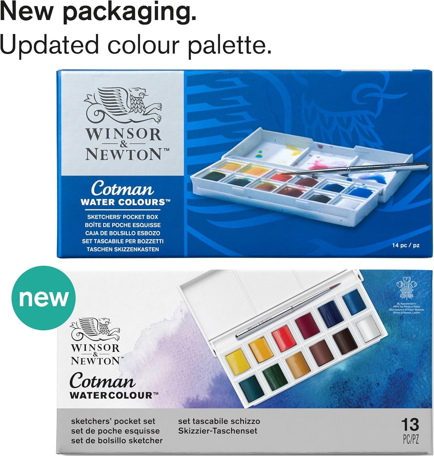
Watercolour paint is essentially pigment — the coloured particles that sit on the paper — suspended in a binder, usually gum arabic. Student-grade sets like Winsor & Newton’s Cotman range use less of the expensive pigment and more filler, which means the colours are less intense and fade more quickly in light. Professional or “artist-grade” paints use higher pigment loads and more carefully sourced pigments, producing colours that mix more cleanly, lift more predictably, and hold their brightness for decades. If you’ve been painting with a Cotman set for six months or more and keep hitting a ceiling — colours that look muddy when mixed, or washes that dry disappointingly pale — the paints are probably working against you, not your technique. This guide maps the upgrade path clearly: what actually changes at each price tier, which brands are worth the jump for Australian buyers, and the single workflow adjustment that prevents you from burning through a tube of Daniel Smith in a week.
| EDITOR'S PICKWinsor & Newton Professional Wa… | Mid-tierWinsor & Newton Cotman Watercol… | Budget pickWinsor & Newton Cotman Watercol… | |
|---|---|---|---|
| Pan Count | 24 | 45 | 12 |
| Paint Tier | Professional | Cotman | Cotman |
| Brush Included | — | ✓ | ✓ |
| Box Type | Metal box | Studio set | Pocket set |
| Set Style | Lightweight metal | Studio | Sketchers' pocket |
| Price | $163.95 | $52.68 | $20.08 |
| See on Amazon → | See on Amazon → | See on Amazon → |
Why Cotman Isn’t the Problem — Until It Is
The Cotman range is genuinely good for what it does. Reviewers at Jacksons Art note in their student-vs-artist watercolour overview that Cotman paints perform respectably for practice, travel, and situations where lightfastness (resistance to fading over time) doesn’t matter. Many experienced painters keep a Cotman set for location sketching precisely because losing or damaging it isn’t catastrophic. The 45-pan set in particular rewards creative use: owners report configuring the duplicate pan slots to complete the full Cotman single-pigment lineup or add metallics, which is a sophisticated workaround that extends the set’s utility well beyond beginner territory.
The ceiling becomes real in three specific situations:
- Glazing and layering — building colour by laying transparent washes over each other. Student paints’ filler content muddies layers faster.
- Granulation effects — the way some pigments separate on wet paper to create texture. Cotman paints are formulated to be consistent, so they don’t granulate the way mineral pigments in artist-grade paints do.
- Light-sensitive work — anything you plan to exhibit, sell, or preserve. Artists Network’s overview of watercolour paint grades notes that some Cotman pigments are rated only “fair” for lightfastness, meaning visible fading is possible within years of display.
If you’re hitting any of these walls, the upgrade is justified. The question is which direction to go.
The Upgrade Options, Mapped Honestly
Gansai Tambi: The Accessible Bridge
Gansai Tambi is a Japanese watercolour range made by Kuretake, sold in sets of 12, 18, 24, and 36 colours. The pans are noticeably larger than Cotman pans, which owners consistently flag as a practical advantage — more paint surface means less scrubbing to load a brush. The pigment quality sits in a genuine middle ground: single-pigment colours are common in the line, which matters for clean mixing.
The YouTube-influence signal around Gansai Tambi is strong and worth understanding: many buyers first encounter it through creator content, which means the community around this paint is unusually well-documented in video form. Owners who have compared it directly to Daniel Smith and W&N Professional — including at least one 18-colour set owner whose review circulates widely — argue the quality difference is smaller than the price gap suggests. That’s a bold claim, and it’s partly true for certain colours and techniques. Where Gansai Tambi genuinely delivers at its price: vibrant, high-saturation colours that reward loose, expressive work. Where it falls short of Daniel Smith: the pigment roster doesn’t include some of the rarer earth minerals and granulating pigments that Daniel Smith is known for, and lightfastness ratings across the range are inconsistent.
Best fit: Intermediate painters who want a noticeable quality step up from Cotman without committing to per-tube professional pricing. Also a strong recommendation for anyone who paints primarily for personal use or digital documentation rather than archival exhibition.
Winsor & Newton Professional: The Reliable Standard
W&N Professional (formerly called “Artists’ Watercolour”) is the longest-established artist-grade line in widespread Australian retail availability. Published manufacturer specifications confirm a high proportion of single-pigment paints across the range, and buyers describe the colour selection as “close to ideal” for primary-colour mixing — meaning you can build a small, carefully chosen palette that covers most mixing needs without redundancy.
According to Winsor & Newton’s own published range overview, every colour in the Professional line carries a lightfastness rating of “Excellent” or “Good,” which is the meaningful threshold for work intended to sell or exhibit. The texture of the paint in the pan or tube is smooth and re-wets reliably, which matters if you’re using a travel set that spends time in a bag between sessions.
The tradeoff: W&N Professional is priced firmly in the premium tier, and the colour range — while excellent — is more conservative than Daniel Smith’s. Painters chasing granulation, unusual earth tones, or the specific mineral pigments used in botanical illustration tend to find Daniel Smith a better match.
Best fit: Painters who want a trustworthy, consistent professional range with strong lightfastness across every colour, and who value broad retail availability in Australia over exotic pigment options.
Daniel Smith Extra Fine Watercolours: The Workflow-Changer
Daniel Smith is an American brand that has become the reference point for serious watercolour practice globally, partly due to its unusually wide pigment range — including PrimaTek colours made from genuine mineral sources like amethyst, malachite, and serpentine. Published specifications from Daniel Smith’s pigment information documentation confirm granulation ratings for each colour, which is rare transparency in this category.
The most important thing to understand before buying Daniel Smith is a workflow shift that owners consistently report: the paint is dramatically more pigment-dense than student-grade paint, and applying it the way you’ve learned to apply Cotman will waste significant product. One widely-cited owner review describes squeezing out far too much paint in the first sessions and losing it before it could be used, because the instinct from cheaper paints is to use more paint to get intensity. With Daniel Smith, the reverse is true — a small amount of paint diluted with substantial water still produces intense colour. Budget for a learning curve of a few sessions before you’re using it efficiently.
The split-primary palette, which Daniel Smith actively promotes in its published educational materials, is worth understanding here: rather than using a single red, yellow, and blue, you select two versions of each primary — one warm-leaning and one cool-leaning. This gives you the ability to mix a much wider range of clean secondaries without muddy neutrals. Daniel Smith’s range is built to support this approach, with multiple reds, yellows, and blues that sit at different points on the warm-cool spectrum.
Best fit: Painters who want maximum control over granulation, transparency, and mixing behaviour, and who are ready to invest time in learning the paint’s characteristics. Also the strongest choice for botanical illustration, architectural watercolour, and anyone building a deliberate, limited palette from first principles.
By the Numbers
| Brand | Approx. AU price per tube (15ml) | Single-pigment colours | Lightfastness standard |
|---|---|---|---|
| Cotman (student) | $5–$9 | Partial range | Mixed (some “Fair”) |
| Gansai Tambi (sets) | $2–$4 per pan equivalent | Common but varies | Variable |
| W&N Professional | $18–$32 | High proportion | All “Good” or “Excellent” |
| Daniel Smith Extra Fine | $22–$38 | Very high proportion | Rated per pigment |
Prices reflect AU retail market as of mid-2026; set pricing varies significantly.
The Paper Question You Need to Settle First
Upgrading your paint while staying on cheap paper is one of the most common intermediate mistakes, and it’s worth naming directly. Wood-pulp paper (the kind in student pads) warps badly when wet, doesn’t accept multiple wet layers without pilling, and won’t lift paint cleanly. Professional watercolour paper is made from 100% cotton rag, which holds water more evenly, allows paint to be lifted and reworked, and survives wet-into-wet techniques without disintegrating.
The standard advice from Artists Network’s watercolour grade overview is to switch to cotton paper at the same time as — or ideally slightly before — you upgrade to professional paints. The reason is mechanical: on wood-pulp paper, the performance advantages of professional paint are partially masked because the surface itself limits what’s possible. If you’re wondering whether your Cotman is underperforming or your paper is the bottleneck, try a single sheet of 300gsm (grams per square metre — a measure of paper thickness and weight) cotton watercolour paper with your existing paints. If the experience changes significantly, paper was the limiting factor.
Frequently Asked Questions
Is Van Gogh watercolour actually better than Cotman at the same price? Van Gogh (by Royal Talens) and Cotman are both strong student-grade ranges, and they’re typically comparable in price in the Australian market. Van Gogh uses a slightly higher pigment load in some colours, and owners report the pans re-wet a little more easily. Jacksons Art’s student watercolour comparison notes Van Gogh as a strong Cotman alternative rather than a clear upgrade. If you’re already invested in a Cotman set, Van Gogh isn’t worth switching to — but if you’re buying fresh at that price tier, either is a reasonable starting point.
When should you switch from practice paper to proper cotton paper as you upgrade paints? The switch to 100% cotton watercolour paper should happen at the same time as — or before — you upgrade to artist-grade paint. Switching paint while staying on wood-pulp paper leaves significant performance on the table. The practical threshold is when you’re consistently doing finished work rather than pure practice exercises.
Are Gansai Tambi paints as good as Daniel Smith for the price? For vibrant, expressive work where you’re not chasing specific granulating minerals or archival lightfastness ratings, Gansai Tambi delivers a genuine quality step above student-grade at a fraction of Daniel Smith’s per-colour cost. For technical, layered, or exhibition-bound work — especially botanical illustration or architecture — Daniel Smith’s pigment specificity and published granulation data make it worth the investment.
What is a split-primary palette and why does Daniel Smith recommend it? A split-primary palette uses six colours instead of three as your mixing foundation: a warm and a cool version of red, yellow, and blue. Because every pigment has a slight colour bias, a single red mixes clean oranges with a warm yellow but muddy purples with blue. Using both a warm-leaning and cool-leaning red solves this. Daniel Smith’s published educational materials recommend this approach because their range includes well-documented warm/cool options across each primary, and it’s the most efficient route to clean secondary mixing without a large palette.
How do you use professional watercolour paints differently from student-grade sets? The main adjustment is volume: professional paints are far more pigment-dense, so you need significantly less paint on the brush to achieve the same colour intensity. Owners consistently report that applying professional paint with the same generosity as student-grade paint wastes expensive product quickly. The adjustment is to start with less paint than feels right, add more water than feels right, and test on a scrap of paper before committing. Within a few sessions, the new calibration becomes instinctive — and you’ll find your paint lasts considerably longer than you expected.
The Decision Rule
If your budget is under $80 and you want a noticeable quality step with minimal commitment, Gansai Tambi is the move. If you want a professional-grade range with reliable lightfastness across every colour and strong Australian retail availability, W&N Professional is the dependable standard. If you’re ready to invest in learning a paint that rewards technical depth — and you want access to the widest pigment range available in a single brand — Daniel Smith Extra Fine is worth the premium and the workflow adjustment. None of these is the wrong answer; they serve different techniques and different relationships with painting. What they share is the ability to stop working against you and start working with you.